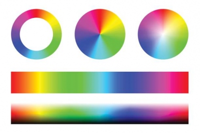
How to choose colour for an online project?

Colour is extremely important!
We perceive almost all information from the outside world visually. Sometimes a product is chosen just because its colour is very pleasing to the customer. Conversely, colour can ruin your career. You don't go to important meetings in bright clothes with strange prints, or in T-shirts and shorts with prints that are quite appropriate for the beach. In the same way, users will perceive your website online. Visitors should get the right colour signals and stay on your site, the colours of the site should not irritate your visitors and cause them negative emotions. They should attract like a magnet and encourage them to take action - to buy your product or order a service.
Therefore, it is very important to choose the right colour palette for your site. Do not use a lot of colours and shades. If appropriate, bright or contrasting can be done only important accents - links, headlines, important messages, and lead the user through the site with them. Typically, for ease of reading - the background of the site is light, the font is black, blue links. These are common standards. Classic of the genre. But you need to consider a number of factors.
Target audience
When choosing a colour scheme, you should consider the target audience of your project. Who these people are: men, women, young people, age, country, income, hobbies, mentality ... Your business should be taken seriously or, on the contrary, they should enjoy the bright colours of an entertaining project. For resources where the primary audience of children, it is better to choose bright and juicy colours. Women - light and gentle shades. Men - dark or neutral. And of course, it is important that all the colours you choose are in perfect harmony with the company logo and its corporate colours. Sometimes the colours used are those established by the logo's designer +-.
How to choose a colour
There are no absolute rules. For any project you can perfectly use absolutely any colour. The main thing is to choose colour combinations skillfully. If your company is called "Orange" then the orange scheme - is natural and strange will be the main colour blue. Although a skilful designer combines blue and orange perfectly:) These days, men can wear red socks with black shoes. Anything is possible, but be careful. Do no harm - the main principle. You want to, but think of your audience. The site should be a model of taste and give aesthetic pleasure.
You don't have to use a lot of colour for the site. 2-4 main colours or their shades. No more. Where and how do I pick them up?
There are a lot of excellent services for matching colours.
Here's one of them - https://paletton.com
You can also search for other services to suit your tastes.
Colour perception by users
Red: represents emotion, fire, passion, love and danger. Designers often use red for links and buttons to get attention. Making red the primary colour is a bold decision.
Often used by: firefighters, marriage agencies, online retailers, promotional websites...
Orange: Youth, energy, movement, strength, positivity, friendship, sunshine. Perfect for youth projects. Can also be used as red to draw attention to a neutral site.
Often used: travel agencies, online shops, children's projects.
Yellow: Sunshine, joy, happiness, enthusiasm.
Often used: travel agencies, online-shops and children's projects.
Green: Growth, stability, forest, grass, prosperity.
Often used: health, nature, finance, agri-business. Everything to do with nature and money. Green is also a favourite colour of pharmacies and health related projects.
Blue: Sky, sea, tranquillity, safety.
Often used: businessmen, nautical themes, online shopping, news sites, social networking sites.
Violet: Luxury, wealth, mystery, mysticism, pomp, romance.
Often used: Casinos, astrology, boutiques.
White: purity, sanctity, goodness, accessibility, tenderness.
Often used: minimalist style, bridal salons, any sites.
Black: Refinement, power. But, remember that black - the colour of sadness and mourning, if the background of the site will be black. Must use skillfully combinations that do not drive visitors into despondency. Can be used with bright yellow, a great combination. Can be used with any bright accents.
Often used: ritual services, gaming projects (combined with bright hues), online shops...
You can pick up the colours yourself. Just visit a few of the successful projects from the top, similar to your topics and analyze what colours your competitors are using. Think about why.
If you are having difficulties with a choice of colours for your project - contact us and we will be glad to study all the details and find you the best palette of colours.
Respectfully, Serafima.
